Sunday, 14 September 2014

Galaxy Note 4 hands-on and first impressions


Galaxy Note 4 hands-on and first impressions

We’re in Berlin for IFA 2014, and the star of the show has just been announced. The Galaxy Note 4 is Samsung’s big hope for this end of the year, after a slowdown at the high-end took its toll on the company’s recent financial results. On paper, the new Note has everything going for it, from a sleek metallic design, to a cutting-edge screen, and enhanced software features. But will the Note 4 be the smashing hit Samsung’s been looking for? We were lucky enough to have some hands-on time with the device ahead of today’s event, so we can give you our first hands-on impressions with the brand new Galaxy Note 4.
Design and build

After a love affair with plastic that has lasted for years, Samsung is finally transitioning the design of its flagship phones to include metallic elements. It started with the Galaxy Alpha, and now the Note 4 is the second device taking advantage of a metal frame to great effect. To be clear, the Note 4 is very similar in appearance to the Note 3 before it, with the same general shape, approximate dimensions, and styling. However, the thin metal band going around its edges gives the Note 4 a much better feeling in hand. It’s not that it’s much thinner than its predecessor, but the slightly tapered profile and the chamfered edges of the metal frame make it feel more compact than it really is.You get the same sculpted profile of the corners, though it seems less pronounced than on the Alpha. Another difference is the fact that the metal frame has a matte texture, which gives it a nice grip.The front and back are very similar to what we’ve known at the Note series for years – the only distinctive element on the front side is the so-called 2.5D glass profile. You’ll see what this means if you look at the edges of the glass covering the Note 4’s front, which are slightly raised above the frame and feature a subtle curvature.On the back, you get the same arrangement of the camera, flash, and heart rate monitor you get on the S5, with a plastic removable back cover. The texture is similar, but not identical to the Note 3’s. And yes, there’s no stitching this time around. Pop the back and you’ll see the standard removable battery, microSD card, and micro SIM slot. Unlike the Galaxy S5, the Note 4 isn’t waterproof – when we asked Samsung’s reps why, they said the Note 4 is for people interested in being productive and creative on the go, while the Galaxy S5 is a more generalist device.The S Pen slot is in the precise same place, while the bottom side of the phone also houses a “regular” microUSB port, instead of the USB 3 port of the Note 3. There are also a couple of microphones on the bottom, with another one at the top.The Note 4 will be available at launch in four color options – Charcoal Black (which is actually a really dark grey), Frost White, Bronze Gold, and Blossom Pink.
Display, hardware, and performance

The big story about the Note 3’s display is its Quad HD resolution. At 5.7 inches and 2560 x 1440 pixels, that gives it a whopping pixel density of 515 ppi. This is the same bright and vivid AMOLED panel Samsung loves to put on its high-end offerings, and it looks just as good as you’d expect. The question is – will you notice that density boost? Personally, we can’t say we noticed a difference, at least not from the hour or so we had with the device. We both (Josh and Bogdan) agree that the display looks great… we’re just not convinced that going Quad HD is a good reason to upgrade to the Note 4.Performance-wise, the Qualcomm Snapdragon 805 version that we got to play with was smooth in most situations. Then again, we couldn’t really put it through its paces, so we can’t say if lag is gone for good. With a cutting edge Snapdragon 805/Exynos 5 Octa processor, the Note 4 should do excellent under intensive loads, and we look forward to seeing how it does in gaming. There’s the whole assortment of hardware features, with a couple that stand out being the noise cancelling microphone setup, the UV sensor, and the fast charging battery. The Note 4 uses three microphones to remove ambient noise when recording, as well as for some selective recording tricks like capturing only the voice of the person in front of you or selectively cancelling out the voices coming from a certain direction. In Samsung’s pre-recorded demo, the noise cancellation worked really well, but naturally, your mileage may vary.As rumored, there’s a UV sensor that can be used to detect radiation levels and get advice for protection. This doesn’t happen automatically, so you can only get discrete measurements from the S Health app. The most interesting new feature is fast charging – we were told that the tech lets you fill up half the capacity of the Note 4 in just 30 minutes, and that charging it completely takes 30 percent less time than with conventional technology. From what we understand, you need a special charger for this to work, so you won’t be able to use the old charger you had laying around in a drawer. This looks like a very exciting feature, coming to a device that has long been known for its battery life. But it remains to be seen what impact that Quad HD screen has on the Note 4’s longevity.
Camera

Another first coming to the Note 4 (for Samsung devices that is) is optical image stabilization. As expected, we’ve got a 16MP sensor with OIS, that should take sharper pics, less noise, and smoother videos. We haven’t really got to test the camera in our time with the Note 4, but signs are looking positive. The app itself hasn’t changed too much, except on the UI front.The front facing camera also received a nice upgrade – there’s a 3.7MP sensor (up from 2.1MP on the Note 3) with a wide angle of 90 degrees (up to 77 degrees on the Note 3) and f 1.9 aperture. If 90 degrees isn’t enough for you and your friends, the Wide Selfie feature lets you do a sort of mini panorama and compose a selfie that is 120 degrees wide. You can simply tap on the heart rate monitor on the back to take a selfie, a welcome addition given the relatively large size of the Note 4.
Software

As usual, Samsung focused on the productivity and multitasking features for this Note iteration. Starting with the S Pen, one of the biggest new features is Smart Select, which is basically another way to “scrapbook” stuff you find online and keep it for later usage. The twist is that you can use it on any site, so you can cut out a hotel description from Yelp and then move to Google Maps for directions, and so on. Smart Select is one of the features you can select from the new Air Command menu.A nice new feature is the ability to select text or images in a gallery by drawing a square around it, like you would with the mouse on your PC. Especially with text, this feature makes selection much easier.Further helping with productivity, Snap Mode lets you photograph some written text or a writing board and have the text converted into a S Note that you can edit to an extent. This works with equations too, but don’t expect to be able to make the actual text editable. There are also improvements to the multi-window feature, which now lets you easily open an app in a floating window.
Wrap up

The Note 4 looks like a solid upgrade over its predecessor, even if there are no new huge features standing out. Overall, the Note 4 is just a very nice refinement of the Note concept, and the touch of metal really gives it the class such a device deserves.Stay tuned to Android Authority for more coverage of the Galaxy Note 4, as well as the new Note Edge, Gear S, and Gear VR. For round the clock IFA action, follow our event page. Impressed with the Galaxy Note 4 so far?

Apple Watch vs Android Wear: what’s different, what’s similar?


Apple-watch
Just yesterday Apple made a pretty big splash by unveiling its first phones to break the 4-inch barrier (4.7 and 5.5-inch models), and its very first smartwatch – both things we’ve already seen in the Android Camp before.


At the time, we asked your opinion of the Apple Watch and gave you a basic rundown of what it was capable of. Now it’s time to look a bit closer and compare it more directly to Android Wear, its biggest competitor. Sure, there are other smartwatches out there, but Google and Apple have the greatest chance at taking these devices beyond their currently niche realm and into the mainstream — sorry, Samsung.


lg g watch r first look aa (8 of 22)


Which is the better timepiece?

First and foremost, these are watches, and that means they need to be able to tell us the time in an effective manner. When it comes to this most basic function, Android Wear has a major advantage in the fact that the display is always on. In contrast, Apple Watch only turns on the display when you lift your wrist. While this usually doesn’t take that long, judging by Samsung’s past implementations with the Gear family, this doesn’t always work as well as it should.


Of course, this isn’t just a watch, it’s a smartwatch. That means we want more than just the time when we go to glance at our watch face


Of course, this isn’t just a watch, it’s a smartwatch. That means we want more than just the time when we go to glance at our watch face. Both watches seem to give us options here, with Apple claiming it has tons of options: “Each Apple Watch comes with a range of watch faces you can change whenever you like. You can also add specialized functions — known in watchmaking as complications — to most faces. Choose stopwatches, stock quotes, weather updates, and more. When you combine all the possible options, the opportunities for personalization are virtually endless.”


To that end, switching and customizing a watch face might be a bit easier on the Apple Watch, but there’s also quite a few options in the Android Wear camp. There are also unofficial watch faces all over Google Play and the experience will get even better when the Android Wear watchface API is released.


Notifications

This is probably one of the biggest reasons to wear a smartwatch over a traditional watch or no watch at all. All smartwatches deliver notifications in some form, though obviously there are going to be some differences.


Although the interfaces are very different (which we will get into a bit later), both watches let all notifications from your phone show up on your watch. Both watches also allow some of these notifications to be responded to directly (Facebook, etc) and both allow developers to add more functionality to the notification experience.


There’s also an easy way to get important information like weather and activities in your calendar. For Google, it’s in the main UI as a card. For Apple, the information is also presented in card form, though in a special “Glances” menu.


Voice integration and Navigation

If you’ve ever used an Android Wear device, you know that voice control plays a big part of the experience. You not only use it to ask questions, but also to quickly access apps, set alarms, and the list goes on. While there are many things that can be done simply by using the touchscreen, there’s no denying that voice makes life a lot easier on Android Wear.


Turning to the Apple Watch, Siri is integrated in, giving you the ability to dictate messages, view events, find stores and other locations, and more. That said, the Apple Watch seems to tout Siri as just one of its features and doesn’t place as great of an emphasis on voice as you’ll find on Android Wear. For example, getting to apps and navigating around the UI is done through a combination of touches on the display and through a crown dial that lets you zoom in and out of apps. The dial also lets you make minor changes to the time and more.


The UI

All this talk about navigating seems to naturally lead into the UI. While Google’s Android Wear focuses on a simplistic card-based layout, Apple’s UI puts all the apps in one place and relies heavily on the crown (Dial) to zoom in and out of apps. Which UI is better likely comes down to preference, though I can’t help but think that Apple’s UI looks nice but feels a bit more cluttered and harder to master than AW.


Most of you should already know what the Google Android Wear UI looks like, but it’s hard to truly explain how the UIs differ with words alone. With that in mind, this vid from Apple will walk you through the Apple Watch platform to give you a better look at it. The video also covers details about its design and more. You do have to put up with Jonathan Ive though — sorry about that.


Health and Fitness

Android Wear and Apple Watch both put emphasis on health and fitness. For Apple, there’s heart-rate monitors, the ability to use GPS from an iPhone to track health and two new apps designed to work with the Watch’s health aspects: Activity and Workout. As for Android Wear, many watches have a heart rate monitor and some next-gen watches like the Sony Smartwatch 3 will even offer integrated GPS, so you don’t have to bring your smartphone with you. There’s also a variety of apps that work with these health functions.


At the moment, both watches seem to offer the same base health/fitness experience, albeit in different packages, (expect AW is actually available, Apple Watch won’t arrive until 2015) and both companies seem intent on expanding this focus in the future.


App Ecosystem

Honestly it’s hard to compare this category just yet. Apple has confirmed they will support 3rd party apps on their watch, but they haven’t gone into a lot of specifics or if these apps will be standalone.


At least for now, Android Wear is the king here, with tons of apps already supporting Android Wear and many more adding functionality with every passing day.


Battery and charging

During its press event, Apple didn’t mention battery life at all. Thankfully several reports have come out, including one from Re/Code that suggests battery life should be in the one-day range — just like Android Wear. Of course, Android Wear’s battery life varies depending on device, with the most beautiful member of the family (Moto 360) reportedly offering up the most disappointing battery life.


As for the charging? Apple uses an inductive wireless charging system, somewhat similar to the Moto 360. Many of its AW competitors, however, use more traditional plug-in methods (cradle) like the G Watch and Gear Live.


Aesthetic differences


Honestly, the Apple Watch’s square look doesn’t stand out that much from what we’ve already seen from Android Wear, though it still utilizes several premium materials to help set it apart a little. In total, there are three different materials: 18k gold, aluminum, or stainless steel. There’s also multiple different bands and each of these materials lets you choose between two sizes — one that’s 38mm in height and another that’s 42mm. Probably the biggest stand out is the crown, used for zooming in/out and a few other functions.


While I’ll admit there’s a decent amount of variance in the Apple Watch camp, Android Wear has three choices right now: the G Watch, Gear Live and Moto 360. That’s two square watches and a circular one. Then there’s the upcoming Asus ZenWatch (Square but different) and the G Watch R (circular), both of which are expected to arrive this year. By the time Apple’s Watch actually hits early next year, we have a feeling there will be several more competitors introduced running AW as well.


Wrap up

Obviously we couldn’t go that in-depth without the Apple Watch in hand, but this should give you a basic idea of how the two platforms differ. It’s also worth mentioning that Apple Watch does a few things Android Wear doesn’t, like the ability to actually place and take calls right from your wrist. There’s also “Digital Touch” features that let you do things like send walkie-talkie messages to other Apple Watch wears, special sketches, heartbeat info (why?) and more. For a full breakdown of all its features, you’ll want to head over to Apple’s website.


Ultimately though, it doesn’t matter which platform is better, as it all comes down to your own personal tastes. Apple Watch is for iOS users, Android Wear is for Android users — at least for now, the choice is made for us, based on the smartphone platform we choose. As you can see, though, both platforms provide largely the same experience, just with obvious differences in how that experience is presented.


As for my own personal feelings, not to start a flame war, but I don’t like the looks of the Apple Watch. I won’t call it ugly, but I will call it uninspired looking. I may not be an Apple fan, but I thought their watch would actually stand out in a good way, at least aesthetically. So call me underwhelmed. As for the software? Until I get a closer look from one of my Apple-loving friends down the road, I’ll reserve judgement. I admit it looks rather nice, but Android Wear’s simplicity still appeals to me a bit more.


What do you think of Apple Watch, both the hardware and the software? Let us know in the comments!


TAGS:#Android Wear#Apple Watch


visit our blog for more details

http://gadgetsnewsforyou.blogspot.in/

please like ous in facebook page and stay updated

https://www.facebook.com/gadgetsnewsforyou?ref=hl

follow us in google+ and subscribe for more

https://plus.google.com/109330075276152017664/posts


Tuesday, 29 July 2014

Nvidia Shield Review


At peak rush hour inside a Mumbai local train, a crowd of people stick to each other with beads of sweat trickling down their faces. On average, three out of every five commuters will be engrossed in round after round of Candy Crush Saga or Angry Birds despite the unpleasant conditions.


Mobile gaming has crossed all barriers - no matter what clothes you wear or which phone you carry, chances are you've been hooked onto at least one game at some point. Mobile games are designed to make you want to keep trying one more round.

Most games today are specifically designed to take advantage of touchscreens. Thousands of titles, ranging from casual puzzles to console-quality adventure games are available in the Android and iOS app stores. iOS might have the advantage right now, but Android can tempt developers with ample opportunities to exploit its versatility - many are already experimenting with consoles based on Android such as Ouya.


In this context, the arrival of the Nvidia Shield - the famed graphics card manufacturer's first Android-based portable gaming device - couldn't have been timed better. Moreover, Nvidia recently announced a price cut, and has rolled out a software update which brings Android 4.4 (Kitkat), cloud streaming capabilities, and many other substantial tweaks to the Shield.


Please note that the Shield is currently not available in India, and indeed if Nvidia plans to ever launch it in the country this portable console has a real neat trick up its sleeve that could set it apart from the competition - game streaming - provided users have the right configuration specified by Nvidia.

Read further to find out if Nvidia's Shield has the right chops to give gaming on Android a much-needed boost.


Call the Xbox police, Nvidia stole their controller
Here's the recipe for making one Nvidia Shield: Take one 5-inch smartphone, attach an Xbox 360 controller with a hinge, and voila, you're done!

Jokes aside, the Shield does have a really striking design and the first thing that caught our attention was the sheer size of the device. It is portable but not pocketable. You won't be able to take it everywhere you go, but you can definitely slip it into your bag for all those times when you just want to start mashing buttons in Real Boxing. The Shield has dimensions of 6.2x5.3x2.2 inches (width x depth x height). At 580g, the Shield is not a light device either. Despite its girth, the Shield feels comfortable to hold for long sessions of gaming, which is reassuring. This is mostly because of the rubberised texture on the bottom of the hard plastic enclosure. Nvidia adds what it calls 'tag' on top of the lid which is a magnetic plate that can be removed or attached at will. Additional tags are available in different colours for customisation. Apart from the obvious visual touch , the tag has no functional use.


The 5-inch LCD screen has a 720p resolution with accurate colour reproduction making it a treat to play games. Attached to the screen, like we mentioned before, is the controller unit which resembles the Xbox 360's controller. In the centre is the Shield button which acts as the power button and can be used to enter the Nvidia Tegra Zone. This button is flanked on the bottom by Android's default home (right) and back (left) buttons, and on the top by start (right) and volume (left) buttons. Moreover, two thumb sticks are placed below the central button cluster.

The D-pad and A/B/X/Y buttons are on the left and right of the controller, respectively. Two speakers are placed above this. The L1/L2 and R1/R2 triggers are at the back of the device and so are the ports, namely micro-HDMI, 3.5mm, Micro-USB and a microSD card slot.


While playing games, the tactile feedback on the thumb sticks and the D-pad are great. The A/B/X/Y buttons have a distinctive click to them and we found the key travel great for firing guns at opportune moments. Navigating the Android OS using the controller is a good option to have but problems crop up whenever you need to type anything. This device is just not suitable for typing, just like tapping through on-screen keyboards is frustrating on regular consoles like the PS3 and Xbox 360. You can use the touchscreen for typing, but it will be awkward and uncomfortable.


Enter the portal
At its core, the Nvidia Shield is a portable gaming console based on Android. After its recent update, the Shield now runs on Android 4.4 (Kitkat). A niggle which was present pre-update was that once clicked, folders on the home screen would bleed into its edges. This visual inconsistency has been eliminated with the update.

The Android experience on the Shield is mostly stock, save for a few preinstalled apps and games. Hitting the Shield button takes users directly into the Nvidia Tegra Zone which is basically a store for buying games that are optimised for Tegra devices. Nvidia bundles two games with the console, Expendable Rearmed and Sonic4. Twitch - the most popular game streaming service - is present too. The console mode is good option for when users want to plug it into a television. It basically lets users play games in full HD, provided the television supports 1080p. In fact, the Shield is touted to be able to play movie files including 4K media on next-gen 4K TVs. Nvidia recommends MX Player for playing these files.

The true piece de resistance is, however, Nvidia Stream - Shield's unique capability to stream games from a capable PC. This is possible provided the PC meets Nvidia's recommended specs: a GeForce GTX 650 or higher GPU, Intel Core i3-2100 3.1GHz or AMD Athlon II X4 630 2.8 GHz or higher CPU, 4GB or more of system memory, the GeForce Experience application, the latest GeForce drivers, Windows 8 or Windows 7, and an 802.11a/g router (minimum). These are really specific requirements and even if a single component in the setup doesn't match streaming might not work (more on this later). The catalogue of supported games is also increasing regularly.


The new update brings Cloud Streaming in a Beta version to the Shield. Currently, this feature is available only in North America and Canada, and it is absolutely free for a limited time. Another rather thoughtful addition in the update is the gamepad mapper, which helps users map keys for games that don't natively recognise the Shield's hardware. These gamepad mappings can be uploaded to the cloud. The upside of this feature is that users can easily locate pre-configured settings for most popular games. They are categorised by ratings and most downloaded. It's simple, out there and easy to access.

You are dead!
The Nvidia Shield is one of the only shipping products to feature a Tegra 4 processor under the hood. Since its launch, the company has announced that its next-generation Tegra K1 processor will launch soon, making us wonder if that is the reason why Nvidia has slashed the price of the Shield. Tegra 4 is still a very powerful quad-core processor and with 2GB of RAM to complement it, the Shield is a beast of a gaming device. The numbers speak for themselves. In the 3DMark Ice Storm Unlimited test sequence, the Shield returned a score of 15,514, and it managed to hit 34.6fps in the GFXbench test. These are some stupendous numbers.

The graphics of some of the more demanding games for Android are spruced up for the Nvidia Shield. For example, in Asphalt 8 we noticed additional lens blurring and crash effects that are not present on other capable devices. Graphical prowess notwithstanding, the Shield is a great device to play racing games on. Actually, even first person shooters are great fun on the Shield. We tried Conduit HD, Into the Dead, Shadowgun: Deadzone and Dead Trigger 2 and immediately managed to sneak in a few headshots on unsuspecting opponents, both real and AI. Another game that caught our fancy was Rochard, a Playstation port, which is an arcade platformer. We really liked how well platformers play on the Nvidia Shield. Real Boxing maps the punching controls to the right thumbstick and knocking out opponents was easier using these controls. The dual front-firing speakers are really loud and don't distort even at high volumes. Considering they are two separate channels, the channel separation is really good too.


Ever since the Shield arrived at our office, we were eager to try out the streaming capability. Unfortunately for us, it failed to work since the only router we had available wasn't up to spec. This takes us back to the point where we mentioned the rather stiff specifications list, and it is a bit of a downer. It isn't likely that many PC gamers in India will be able to meet the minimum system requirements.

The End
Nvidia plays safe by choosing a platform that is already popular and contains a huge catalogue of games. There are a few console-grade titles as well which have already been either tweaked to support the controller or are in the process of being tweaked. Additionally, the Shield is a perfect example of making a sturdy device with a unique feature that sets it apart from the competition like thePlaystation (PS) Vita or the Nintendo 3DS. However, that isn't enough considering the game streaming requires a really beefy configuration on the PC. Also, the games on Android are much cheaper than on the PS Vita or the 3DS.

Cloud game streaming could actually be the future of gaming considering Sony is already experimenting with the idea, and now a portable device like the Shield is attempting to do the same. But this tech may not really take off unless broadband speeds across the world improve enough for lag-free gaming.


In spite of all the arguments we must applaud Nvidia for engineering the Shield. At the current price of $200, tech enthusiasts with a capable PC can pick up the Shield from a country where it is being sold. Considering its age in international markets, an Nvidia Shield 2 powered by a Tegra K1 processor might be just around the corner - benchmark results for such a device have already popped up on Antutu.

Price: $200 (approximately Rs. 12,000) shipped to US or Canada.

Pros


Sturdy design

Superb controller

Future-proof features


Cons

Limited number of console-grade games

Bulky


Ratings (Out of 5)

Design: 4
Performance: 4.5

Value For money: 4

Overall: 4

Wednesday, 16 July 2014

Sony Xperia E1 Dual Review: Funky and Affordable


Sony is just one of a growing number of international companies now attacking the bottom end of the Indian smartphone market. It isn't surprising, considering how much growth there is to tap in India, and how many people are still yet to buy their first smartphone. For customers, it's a win-win situation: high-quality phones are becoming more affordable, after-sales service is no longer a total gamble, and features keep trickling down from high-end handsets.

Sony, despite its ups and downs, has impressed us of late with some very slick, consistent hardware. The Xperia Z2 is a solid, well-balanced flagship phone and the Xperia M2 is beautiful in its own right. Let's see if Sony can manage to apply the same formula at a much lower price target and displace the popular Motorola Moto E.


Look and feel
The Xperia E1 Dual (and its near-identical twin, the single-SIM E1) are small, chunky and plastic all over. There are definite similarities to Sony's higher-end models, most notably the two-tone body and the power button in the middle of the right side. This could easily be the best looking phone in this price range, and the build quality is fantastic.

The E1 Dual is surprisingly light at 120g, but its thickness and matte plastic back make it really comfortable to hold. The screen measures four inches diagonally but thanks to the use of on-screen buttons, there isn't much plastic above or below it. There's a large Sony logo above the screen, plus a earpiece cutout, sensors, and notification LED that's invisible unless lit up.

The notification LED is a bit odd because when it isn't red or green to show your battery charge status, its colour seems to change depending on the angle you're looking at it. It could be white, blue, cyan, purple or orange and we wouldn't be able to tell whether they mean different things. There's also another hidden LED below the screen which lights up briefly in a random colour when tracks begin playing in the Walkman app, for no apparent reason whatsoever.


The camera lens on the rear is nicely recessed so that it won't scratch easily. There's another printed Sony logo and a more subtle engraved Xperia logo on the rear, but the most noticeable thing is the enormous speaker grille across the device's entire width.

The power button is on the right edge in keeping with Sony's current "omnibalance" design direction, but it doesn't work at all on such a small device. It's hopelessly inconvenient to get to when needed, and there are no shortcuts such as double-tapping the screen, which would have make this easier to deal with. Sony has also decided to place a dedicated Walkman button on the top right edge, right where the power button should be. Making matters infinitely worse, pressing the Walkman button even lightly makes music start playing at whatever volume you left it - it's possible to trigger this even with the screen locked if the button is pressed twice. Needless to say, this led to some very awkward moments in our office during the review process.

There's a headset socket on the top and Micro-USB charging port on the left edge. The rear panel pops off to reveal the removable battery and microSD card slot. You have to pull the battery out to get to the two regular-sized SIM card trays, but microSD cards can be hot-swapped. You'll also notice that the speaker itself is a lot smaller than the grille makes it out to be.


Features, specifications and software
The E1 Dual is powered by a Qualcomm Snapdragon 200 SoC, with a 1.2GHz dual-core processor and Adreno 302 graphics. This is decidedly low-end, but it's modern enough and should perform better than phones in this price range which are based on MediaTek silicon. We shouldn't expect more than half a gigabyte of RAM, and internal data storage capacity is similarly limited to 4GB.

The screen measures 4 inches diagonally, and its 480x800-pixel resolution is just about enough. We have to keep reminding ourselves how inexpensive this phone is, since it really doesn't feel cheap.

The 3-megapixel camera doesn't have a flash, and it's probably for the best that there's no front camera. The battery also seems a bit puny at 1700mAh. On the bright side, there's Bluetooth 4.0 and Wi-Fi b/g/n along with FM radio, A-GPS and a digital compass. The E1 Dual officially supports microSD cards up to 32GB in capacity.


Sony's distinct Android skin makes an appearance here, on top of Android 4.3. It's one of our preferred custom interfaces, though it does feel quite cramped on such a low-resolution screen. You also lose a bit of screen space thanks to the use of soft buttons - until an update to Android 4.4 is released, several apps and games won't be able to run in full screen mode. There are other tradeoffs too, for example the keyboard is cramped and it's really easy to hit the navigation buttons when typing since they're right beneath it. At least there's a dedicated Recents key instead of the more common but redundant Menu key.

The interface should be familiar to anyone who has used a recent Sony smartphone. There's the usual excessive bloatware both on the home screens and in the app launcher menu. Sony bundles loads of apps including its Sony Select content showcase, the Walkman app, Movies and Album apps, TrackID, Xperia Care Support, and Smart Connect. Then there's the usual suite of Google apps, including Gmail Maps, Hangouts, YouTube, Google+, News & Weather, and the Play store.

That's a lot of preloaded apps; many of which have overlapping functionality and none of which are removable. These plus the multiple default homescreen widgets make the phone's software feel cluttered. While the Sony Xperia E1 Dual is a very affordable phone, all this confusion means it might not be the most suitable choice for first-time Android users. Sony could easily have toned down its software assault for this device.


Camera
Some things are scaled down, for example the camera app. Sony's usual plethora of filters, effects and modes are mostly missing. There's only an Auto Scene mode, a Manual mode, Sweep Panorama and Picture Effect. Auto mode is pretty self-explanatory, and there's almost nothing you can do other than point and shoot.


Manual allows you to adjust the exposure compensation, white balance, ISO, and photo/video resolution. There are 16 scene presets to choose from manually, such as low light, fireworks and snow, as well as a largely useless HDR setting. The Picture Effect options are just basic filters, and you can expect the phone to slow down significantly when using them.


The Xperia E1 Dual is definitely not going to help you take amazing spontaneous photos. For starters, the camera app is terribly slow - much more so than the rest of the UI - and there's way too much shutter lag. The camera itself has a fixed-focus lens - you can't tap to focus or compose images.

The photos we took with the E1 Dual during the course of our testing were all uniformly disappointing. You can forget about taking shots of any landscape or scenery; the camera only works on nearby subjects such as faces. The leaves on a tree, for example, just looked like an artificially generated texture. Edges were harsh and poorly defined, and exposure was completely off balance. Even with simpler subjects, the camera was underwhelming - don't expect to be able to read regular-sized text or see any subtle detailing.


Performance
The Xperia E1 Dual isn't a speed demon by any stretch. It's good enough for basic everyday usage and a bit of music, social networking and Web browsing on the side. It takes a second or so to switch apps or move between screens and in some cases Sony's own animated transitions make the phone feel like it's slow to respond.

Benchmark results were quite average, though we were happy to note that graphics scores were around twice as high as those of even slightly higher-priced phones, thanks to the choice of a well-balanced Qualcomm SoC rather than a competing chip with more CPU cores but worse GPU performance.


The screen is not all that sharp, which means that text is just a bit blocky and colour gradients look grainy. This isn't really a problem unless you're used to higher-quality screens already. The backlight can get really bright but contrast is lacking. This also means legibility is poor in sunlight.

Sony is heavily pushing the E1 Dual's speaker, which we agree is surprisingly loud and clear. Even classical music doesn't sound terrible - though that isn't saying much for a phone's built-in mono speaker. The Sound page of the Settings menu has an option called Clear Phase which claims to improve quality (though we couldn't discern any change) and another called xLOUD which pushes the maximum volume level quite a bit.

Battery life was a bit disappointing at just over five hours in our video loop test. However call quality and network reception were good.


Verdict
The Sony Xperia E1 Dual competes with the Motorola Moto E, HTC Desire 210 Dual SIM, AsusZenfone 4, and Nokia X Dual SIM, in addition to multiple options from local brands. We find that Sony, Motorola and Asus have the edge here, each with a different set of strengths and weaknesses.

The Moto E is a shade less expensive than the Xperia E1 Dual and will appeal to fans of stock Android, though in every other regard the two are very similar. We'd lean towards recommending the Motorola option for anyone new to smartphones, thanks to the E1's awkward button placement and cluttered software. The Zenfone 4 has an interesting advantage with 8GB of internal storage and we were very impressed with its larger sibling, the Zenfone 5. To be fair, its Intel Atom Z2520 processor is not yet proven, so we'll reserve judgment on the Zenfone 4 till we've tested it ourselves.

We do like the Sony Xperia E1 Dual (and by extension, its cheaper twin the E1) but it's a crowded market. Go for this phone if you're comfortable with Sony's Android skin and if its style appeals to you. Otherwise, the Moto E is a solid alternative.


Sony Xperia E1 dual detailed specifications

General
Release date January 2014
Form factor Touchscreen
Dimensions (mm) 118.00 x 62.40 x 12.00
Weight (g) 122.00
Battery capacity (mAh) 1700
Removable battery Yes
Bundled accessories Charger, cable, headset
Colours White, Black, Purple
SAR value NA
Display
Screen size (inches) 4.00
Touchscreen Yes
Touchscreen type Capacitive
Resolution 480x800 pixels
Pixels per inch (PPI) 233
Colours 16M
Hardware
Processor 1.2GHz dual-core
Processor make Qualcomm Snapdragon 200
RAM 512MB
Internal storage 4GB
Expandable storage Yes
Expandable storage type microSD
Expandable storage up to (GB) 32
Camera
Rear camera 3.15-megapixel

Flash No
Front camera No
Software
Operating System Android 4.3
Java support Yes
Browser supports Flash No
Connectivity
Wi-Fi Yes
Wi-Fi standards supported 802.11 b/ g/ n
GPS Yes
Bluetooth Yes, v 4.00
NFC No
Infrared No
DLNA No
Wi-Fi Direct Yes
MHL Out No
HDMI No
Headphones 3.5mm
FM Yes
USB Micro-USB
Charging via Micro-USB Yes
Proprietary charging connector No
Proprietary data connector No
Number of SIMs 2
SIM 1
SIM Type Regular
GSM/ CDMA GSM
3G Yes
SIM 2
SIM Type Regular
GSM/ CDMA GSM
3G Yes
Sensors
Compass/ Magnetometer Yes
Proximity sensor Yes
Accelerometer Yes
Ambient light sensor No
Gyroscope No
Barometer No
Temperature sensor No

Saturday, 12 July 2014

Asus ZenFone 5 Review


Pros:
Stylish design; Sturdy construction; Crisp HD screen; Good camera; Smooth user experience.
Cons:
Music output could have been better; Not ideal for single-handed usage.


Asus ZenFone 5
Price: Rs 10,000

Chinese Taiwanese electronics brand, Asus, has introduced three Android smartphones in the Indian market. Out of the lot, the ZenFone 5 offers the essential smartphone features at an affordable price of Rs 10,000. It also gives Intel a chance to prove its worth in the smartphone market, which is dominated by Qualcomm and MediaTek.

Build And Aesthetics
The ZenFone 5 is undoubtedly the best looking handset you can buy for Rs 10,000. Much like the HTC One, this phone is tall and has a slightly curved back. The grey metallic strip below the capacitive keys add character to the handset.

The ZenFone 5 is quite a sturdy handset. In this price segment, it's the only handset that can challenge the Lumia 630 in terms of build quality. Similar to the Lumia line-up, the ZenFone 5 comes in variety of colours such as red, purple, gold, black, and white. Attention to detail is also something worth mentioning for this handset. Especially, the speaker grille on the back-panel shows the precision of the build. Overall, the ZenFone 5 is an HTC One look-alike at a dirt-cheap price. What more would you ask for?

The phone's back-panel is removable, which provides access to a microSD and SIM card slots. However, the battery is non-user replaceable.


Display
The phone features a 5-inch HD IPS screen. Its sharpness is nothing short of impressive. The colour reproduction and viewing angles are good too. The display is reasonably bright. The panel is protected by Gorilla Glass. It's undoubtedly the best display you get on a sub 10k phone from a reputed brand.

Specifications
The Asus ZenFone 5 is powered by Intel's Dual-Core Atom Z2560 chipset clocked at 1.6 GHz. It packs in 2 GB RAM, 8 GB internal storage, microSD card slot, 8 megapixel camera, Wi-Fi, Bluetooth, 3G, A-GPS, and 2110 mAh battery. Unlike Motorola and Nokia, the Chinese manufacturer Asus has been generous enough to offer a 2 megapixel front-facing camera and an LED flash.

Software
The ZenFone 5 runs Android JellyBean 4.3 out-of-the-box. The more affordable Moto E running Kitkat beats Asus in terms of the version number. However, the Chinese manufacturer's ZenUI looks much more modern than what you get on the stock Android ROM. Most interface elements are borrowed from HTC's Sense customisation, so no points for the originality, but it looksnice nonetheless. Asus has promised the 4.4 KitKat update soon. But from the past experience, I can tell that Intel chipsets are usually the last in the line to receive the update.


The ZenFone is one of the few affordable Android devices that aren't sluggish. Asus has put in a lot of efforts to optimise the software for Intel's Atom platform. The 1.6 GHz dual-core Z2520 processor with Intel Hyper Threading Technology is no slouch either. Backed by 2 GB RAM, it runs most high-end games without any problem.

For those interested in numbers, we ran a couple of popular synthetic benchmarks.

AnTuTu: 19,545
Quadrant: 9313

Multimedia
Unlike most budget handsets, the ZenFone 5 comes with a pair of decent earphones. The phone's sound output could have been better though. It especially sounds under-whelming when compared to the Moto G and Lumia 630. As usual, you get plenty of equaliser settings to play around with. Moving on to video playback, the handset can handle most formats up to 1080p quality. If you stumble across an unsupported format, you just have to grab a third-party apps such as MXPlayer.


Camera
The onboard 8 megapixel camera is one of the best in its class. The resulting images contain plenty of details. The colours are mostly accurate. If I have to be nit-picky though, I would want Asus to work on lowerering the visual noise. The phone comes with low-light mode called PixelMaster, which does help a bit in night photography. However, don't expect it to match the Lumia quality yet. You can view the ZenFone 5's untouched camera sample by clicking here.

The phone records Full HD (1080p) videos at 30 fps. The resulting clips offer consistent frame-rate, which assures smooth video playback.

Telephony And Messaging
The dual-SIM handset support micro SIM cards. Since Asus is not primarily a phone manufacturer, we had doubts about the ZenFone 5's call quality. However, during my week's usage, I found the in-call voice quality to be very good. The network reception was spotless too. On-screen keyboard layout is almost similar to what we get in stock Android. The only change worth mentioning here is that it's a bit taller to accommodate numeric keys.


Battery
The ZenFone 5 packs in a 2110 mAh battery. Like most Android phones, this phone lasts for a day on a full charge.

Verdict
The ZenFone 5 is an aggressively priced handset. Selling for Rs 10,000, this handset gives the Moto G a run for its money. The ZenFone 5 shines with its sturdy construction and stylish looks. Its screen and performance are as good if not better than the Moto G. In the camera department, it trashes Motorola's more expensive offering. In short, if you're in for a budget Android handset with all round performance, the ZennFone 5 is the handset to get. Yes, it's better than the Moto G, and its success will propel Intel as a serious competitor in the smartphone silicon market.


Features: 4/5
Design and Build Quality: 4/5
Performance: 3.5/5
Value For Money: 4/5
Mojo: 4/5

Overall Rating: 4/5

Wednesday, 9 July 2014

Flipkart Digiflip Pro XT 712 Review: A Calculated Move


Digiflip Pro XT 712 specifications


7-inch (1280 x 720 pixels) capacitive multi touch IPS display

Android 4.2.2 (Jelly Bean) OS

Dual SIM (2G + 3G) with dual standby

1.3 GHz quad-core processor with 500 MHz Mali 400-MP2GPU

5MP autofocus rear camera with LED flash

2MP front-facing camera

3.5mm audio jack

Dimensions: 113.7 x 185.3 x 9.2 mm; Weight: 285 grams

Accelerometer, Light Sensor, Proximity sensor

3G HSPA+ (via SIM card slots), WiFi 802.11 b/g/n , Bluetooth 4.0 LE, GPS / A-GPS, USB OTG

1GB RAM, 16GB internal memory, up to 32GB expandable memory with microSD

3000 mAh battery


Flipkart has decided to throw its considerable brand power behind retail products. Much like other retailers have in the past, Flipkart will sell its own products alongside those of every other brand - with maybe just a bit more promotion.

The Digiflip Pro XT 712 is the first of a promised range of digital devices sourced and sold in India by Flipkart. It's aimed at value-conscious buyers who already have quite a few options to choose from.

For this to not backfire and hurt the company's image, the Digiflip Pro XT 712 should of course work well, feel sturdy, and be reliable. Flipkart has chosen to jump in to the low end of the tablet market, which also makes things interesting. Let's see whether the move has paid off.


Look and feel
The front face of the XT 712 is completely unremarkable. It's basically just a frame around a screen. The device uses on-screen buttons, there's nothing at all to see. The small speaker grille and front-facing camera are the only things that indicate which way is which.

However, this minimalism is not continued on the back. There's a large printed Digiflip Pro logo in the middle, some regulatory text printed near the bottom, and stickers for the device's serial number and registration number flanking the speaker grille. For some reason, the company has also printed icons for each of the device's ports and buttons on the rear. We really don't know why anyone thought this was a good idea - it's ugly and unnecessary.


The rear panel is not removable, but the plastic strip along the top edge snaps off to reveal the two SIM card slots and microSD card slot. There's a large chrome-ringed camera with a flash in the upper left corner. Overall, the back is pretty crude and you'll probably want to conceal it with a case as soon as you see it.

The power and volume buttons are on the left edge, and the headset jack and Micro-USB port are on the top and bottom respectively. We weren't surprised that the front face picks up smudges very easily, but the rear does as well. 285g also isn't too heavy for a tablet, and we didn't have much trouble holding or using it.

The XT 712 can be used as a phone, though of course holding it up to your ear will be comically awkward and uncomfortable. You're way better off using a wired or Bluetooth headset.


Features and specifications
The components that make up the XT 712 will not set any world speed records, but they're enough for a budget tablet. The device is powered by a 1.3GHz quad-core MediaTek processor with Mali 400MP2 graphics, and has 1GB of RAM. There's 16GB of internal storage space and support for up to 32GB more via microSD.

The 7-inch screen has a resolution of 800x1280 pixels, which translates to a comfortable 16:10 ratio. There's a proximity sensor, an ambient light sensor and an accelerometer as well as FM radio, Bluetooth 4 and Wi-Fi b/g/n.


Despite its otherwise lacklustre attributes, the XT 712 comes with loads of accessories. Flipkart and Digiflip really stuffed the box - you get not only the standard charger, USB cable and headset but also a USB OTG dongle, a short 3.5mm extension cable (for no apparent reason), a cleaning cloth, and a screen protector film which in our case was already stuck on to the device.

Flipkart also throws in loads of offers. You get Rs. 5,300 worth of discounts on items purchased through the Flipkart app on the tablet - the company claims these are somehow tied to each device, not to a user's account. How this works is that you get between Rs. 250 and Rs. 500 off in each of 13 product categories, but only once each and only on purchases above minimum values which range from Rs. 1,000 to Rs. 2,500. You'd have to spend at least Rs. 17,000 to use all these discounts, so their actual value is questionable. You also get 12 free preselected ebooks. All offers must be redeemed before the end of 2014.


The software is pretty much stock Android, though we're stuck at version 4.2.2. There's very little UI customisation, but Flipkart's shopping and ebook apps are preloaded, along with MX Player and a few others. The on-screen buttons are near-permanently visible against a black band, but this will change if there is an update to Android 4.4.

Camera
As expected, the Digiflip Pro XT 712's camera is quite awful. There's almost no detail at all in captured images unless you're standing quite close to a subject and the lighting is very favourable. Most photos came out dull and blotchy. The camera had trouble deciding on exposure levels, but it did manage somewhat sharp shots at extremely close range. Video was similarly disappointing. Overall, this is a camera you'd only ever want to use if there was no available alternative at all.


Performance
The Digiflip Pro XT 712 delivered acceptable scores in our test suite, roughly comparable to smartphones with similar specifications in the same price range. Graphics scores were predictably weak, and we noticed a little bit of tearing in casual games such as Temple Run 2, although not enough to affect playability. There was occasionally a little bit of lag when moving through the Android interface as well.


Most 1080p videos were unwatchable, though 720p samples played well. The screen is just not suitable for use outdoors, and text was difficult to read even at maximum brightness. Sound from the speaker was muffled and soft, and the placement of the speaker worsened this when the XT 712 was placed on any flat surface. The bundled headset is easily one of the worst we've ever tried using - it might do for voice calls, but don't even try using it for music.

Battery life was just about average, at 5 hours, 22 minutes in our video loop test. The XT 712 will need to be charged at the end of each day if you use it for enterainment, which is the appeal of oversized tablet-phones in the first place.


Verdict
Flipkart has chosen a high-growth product category for its first in-house device, and is using it as somewhat of a Trojan horse to promote its own store, apps and content business. There are definite echoes of Amazon's strategy here - and in the recent launch of the Flipkart First subscriber benefits program - but adapted for Indian conditions. We're absolutely sure that there's more to come, in the form of products as well as service offerings. It will be very interesting to see how Flipkart leverages its reach and customer base as this strategy unfolds.

As a product on its own, the Digiflip Pro XT 712 leaves us a bit underwhelmed. There are other choices on the market for roughly the same price, including the Samsung Galaxy Tab 3 Neo andLenovo A7-50 (both of which feature in Flipkart's own feature comparison table). In terms of specifications alone, the XT 712 looks the strongest of the three, but the others have the edge when it comes to other factors such as construction quality and battery capacity.

If Rs. 10,000 is the absolute maximum you can spend, then you can consider the XT 712, but we'd recommend bumping up your budget just a little bit to get a stronger product. If you don't need voice calling or 3G data, Dell's Venue 7 is a compelling alternative. For Rs. 2,500 more, you can pick up theAsus Fonepad 7 Dual SIM or the 3G (non-voice) version of the Venue 7.

Tuesday, 8 July 2014

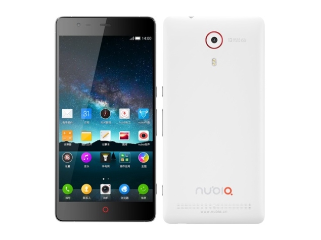
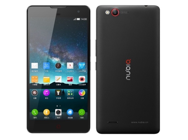
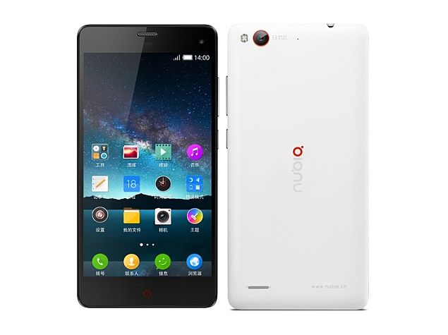
ZTE Nubia Z7, Z7 Max and Z7 mini Smartphones Launched With Snapdragon 801

zte_nubia_z7.jpg


ZTE, a Chinese multinational telecommunications firm, has introduced three new smartphones under its Nubia range - Nubia Z7, Nubia Z7 Max, and Nubia Z7 mini. Both Nubia Z7 Max and Z7 mini are the variants of the Nubia Z7.

While the ZTE Nubia Z7 (See above) is priced at CNY 3,450 (roughly Rs. 33,300), the Nubia Z7 Max and Z7 mini come with a price tag of CNY 1,999 (roughly Rs. 19,300) and CNY 1,499 (roughly Rs. 14,500) respectively. The availability details of the three handsets are not clear as of now.

Some of the specifications the Nubia Z7, Nubia Z7 Max (See below) and Z7 mini share are Android 4.4 KitKat OS, 4G LTE, Bluetooth 4.0, NFC, FM radio and Wi-Fi b/g/n connectivity along with a 13-megapixel rear and 5-megapixel front-facing camera.


While the Nubia Z7 and Nubia Z7 Max come with 32GB of inbuilt storage, only the Nubia Z7 mini (16GB inbuilt storage) and Z7 Max are shown listed with up to 64GB of external storage support. In addition, the Qualcomm Snapdragon 801 (MSM8974AC) processor powers the three smartphones. However, while the Nubia Z7 and Nubia Z7 Max processors are clocked at 2.5GHz, the same processor in Nubia Z7 mini is comes clocked at 2GHz.

While the ZTE Nubia Z7 and Z7 Max both feature a 5.5-inch screen size, the former flaunts a QHD (1440x2560 pixels) resolution display while the latter sports a full-HD (1920x1080 pixels) resolution display. The Nubia N7 mini (See below) however sports a smaller 5-inch screen with a full-HD resolution.


The Nubia Z7 houses 3GB of RAM, is backed by a 3000mAh battery and measures 153.2x75.5x8.9mm. The Nubia Z7 Max and Nubia N7 mini run on 2GB of RAM and are powered by 3100mAh and 2300mAh batteries respectively. While the Nubia Z7 Max measures 152.7x76x8.7mm, the Nubia Z7 mini measures 140.9x69.3x8.2mm. 


ZTE nubia Z7 Max


DESIGN
Device type:
Smart phone
OS:
Android (4.4) Nubia 2.0 UI
Dimensions:
6.01 x 2.99 x 0.34 inches (152.7 x 76 x 8.7 x mm)
Weight:
5.64 oz (160 g)
the average is 4.8 oz (137 g)

DISPLAY
Physical size:
5.5 inches
Resolution:
1080 x 1920 pixels
Pixel density:
401 ppi
Touchscreen:

Multi-touch
Features:
Light sensor, Proximity sensor

CAMERA
Camera:

13 megapixels
Flash:
LED
Aperture size:
F2.0
Features:
CMOS image sensor, Autofocus, Optical image stabilization, Geo tagging
Camcorder:

Yes
Front-facing camera:

5 megapixels

HARDWARE
System chip:
Qualcomm Snapdragon 801 8974-AC
Processor:
Quad core, 2500 MHz, http://www.nubia.cn/​product.php?sid=458
Graphics processor:

Adreno 330
System memory:
2048 MB RAM
Built-in storage:
32 GB
Storage expansion:
microSD, microSDHC, microSDXC up to 64 GB

BATTERY
Capacity:
3100 mAh

MULTIMEDIA
Music player:
Filter by:
Album, Artist, Playlists
Features:
Album art cover, Background playback
Radio:

FM
Speakers:
Earpiece, Loudspeaker
YouTube player:
Yes

INTERNET BROWSING
Built-in online services support:
YouTube (upload), Picasa/Google+

TECHNOLOGY
GSM:
850, 900, 1800, 1900 MHz
UMTS:
850, 900, 1900, 2100 MHz
FDD LTE:
1800 (band 3), 2100 (band 1), 2600 (band 7) MHz
TDD LTE:
1900 (band 39), 2300 (band 40), 2500 (band 41), 2600 (band 38) MHz
Data:
LTE, HSPA (unspecified), HSUPA, EDGE, GPRS, EV-DO
Multiple SIM cards:

2 slots
Positioning:
GPS, A-GPS
Navigation:


CONNECTIVITY
Bluetooth:

4.0
Wi-Fi:

802.11 a, b, g, n, n 5GHz, ac
Mobile hotspot:
Yes
USB:

USB 2.0
Connector:
microUSB
Features:
Mass storage device, USB charging
Other:
Tethering, Computer sync, OTA sync

OTHER FEATURES
Notifications:
Haptic feedback, Music ringtones (MP3), Polyphonic ringtones, Vibration, Flight mode, Silent mode, Speakerphone
Sensors:

Accelerometer, Compass

Voice dialing, Voice commands, Voice recording


Android L: 8 New Features in the Next Major Android Release

android_l_devices_google.jpg

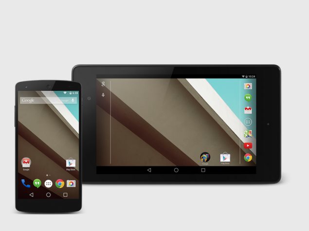
Android has grown from a tiny upstart to the world's dominant mobile computing platform with over a billion active users. Google isn't sitting still, though, and has just unveiled what it calls the most ambitious Android release yet. Currently known only as Android L, there's no dessert-themed codename or even formal version number yet. Android L will release later this year, though an exact date isn't known.

We hope to see new smartphones launch around the same time which take advantage of all the new features, and also updates to existing smartphones. HTC is amongst the companies committed to bringing it to its existing HTC One family, while others should announce support soon.

Here are some of the most exciting new features of Android L

Material design
Android will receive a complete visual overhaul aimed at promoting a consistent experience across Android device sizes and types. The new "Material Design" identity is bolder, more colourful, and more animated. Every transition between screens and every user interaction has been refined, down to the system-wide Roboto typeface and the Android navigation buttons.

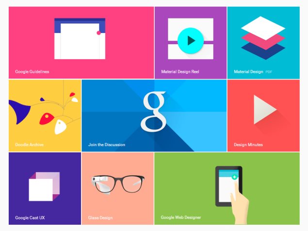
The change could also be aimed at discouraging third-party vendors from developing custom Android overlays which greatly deviate from Google's vision. A strong enough core UI experience could lead users to reject anything seen as inferior to it.Screen elements will be able to simulate depth, with automatic shadows and scaling, but will also inherit elements of classic magazine typography and layout. There's more emphasis on simple shapes and consistent actions that lead you from one app into another. Google's new design page offers hints of what is to come.

The Material Design identity integrates elements of responsive Web design and will extend to other Google properties including Gmail, which will be redesigned for the Web as well as mobile apps. Material Design takes into account the fact that touch, voice, mouse and keyboard are all equally important input methods, clearly illustrating goals above and beyond smartphone usage scenarios.

Improved notifications
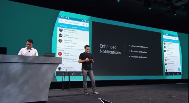
You will be able to interact with notifications more easily in Android L. For starters, you can choose which ones show up on the lock screen and what amount of detail they'll show. You can decide whether snippets of actual messages are displayed when your phone is potentially visible to others, or whether more details will only be revealed when you unlock it. They also aren't necessarily displayed in chronological order anymore - the OS can learn which ones you're more likely to respond to urgently and prioritise those.

There's also a new type of notification altogether - Google calls these heads ups. These appear on top of whatever you're doing and allow you to take action or dismiss them immediately. These are meant to be less intrusive, and can be used for things that can't wait, such as incoming calls.

Trusted environments
Speaking of the lock screen, you'll soon be able to have your phone detect when it's in a trusted environment, which will dispense with the lock code. This could be triggered by the presence of a Bluetooth device such a smartwatch that you wear all the time, a specific Wi-Fi access point, or other factors. When the environment is deemed safe, you won't have to bother with unlocking your phone.

Project Volta, battery improvements
Android L will be able to manage battery life much better, but Google's moves go beyond that to the app development stage, for which new tools have been developed that let developers track battery drain and optimise apps before they ever reach end users. The battery saver mode is similar to those implemented by third parties so far - non-essential services can be turned off or made to run only at intervals in order to save power. Android L will also be able to lower the screen refresh rate, reduce the frequency of data exchanges, or force apps to change their behaviour to match the prevailing battery state.

Google Fit
Everyone's getting into health and activity tracking, and Google is no exception. The new Google Fit framework will take Apple's Healthkit head on, tying into sensors on phones themselves as well as connected accessories to collect data which will be ready for apps to use. Major partners including Nike, Adidas, Runkeeper, HTC, Asus, LG and Motorola are already on board. Google Fit could monitor physical activity and food intake as well as health indicators such as heart rate and breathing.

Greater Web integration
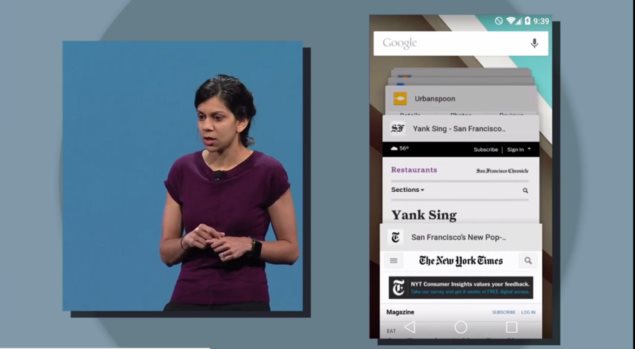
There's also a change to the way individual tabs and documents in apps are handled by Android L. They'll now show up as individual entries in the Recents menu, allowing users to jump directly between them. This pulls the focus away from apps and puts it onto all the things you do with them. For example, Web apps open in Chrome tabs would appear much like native apps running on your device, and you'd be able to jump in and out of them more quickly.

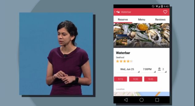
Links on the Web can now also be used to launch apps instead of websites (presumably falling back to the website in case the app is not installed). For example, Google demonstrated looking up a restaurant in Chrome and then tapping a link to not only launch the OpenTable app, but also have it know that it should bring up that restaurant's booking page. Google search results can also now be links that trigger an app, rather than links to websites.

ART Runtime and Android Extension Pack
Google is ditching the Dalvik runtime which has served well for years, in favour of a new one called ART. It can make apps load and run quite a bit faster while using less RAM. ART is 64-bit compatible, and is also engineered to allow apps to work across hardware architectures such as ARM and X86. This also means that Android devices will be able to address more RAM than the 32-bit limit allowed.

With greater diversity in Android hardware obviously envisioned for the near future, the move is a welcome change. Google has worked with major hardware vendors to enable more fluid graphics, potentially paving the way for new Android-based game consoles and set-top boxes. Desktop-class graphics including tessellation, geometry shaders and texture compression will potentially be possible on Android devices.

Knox
Google also made a few announcements that indicate interesting things on the horizon for enterprise users. The company announced that Samsung's Knox feature for work and personal separation will become a part of Android itself. Knox allows corporate IT administrators to control work-related data and policies on employees' smartphones while letting the employees themselves continue to store personal data and use unrelated apps. This alleviates many of the problems with accessing secure information from mobile devices and could make Android far more attractive to businesses.

Monday, 7 July 2014

LokLok connected lock screen app now in open beta


loklok


LokLok, an app which offers android smartphone owners a connected lock screen experience, is now available in an open beta version on the Google Play Store.
LokLok is designed to replace the standard lock screen with one that can be shared with other smartphones. It has been in closed beta testing for several months before launching in its open beta version on Sunday. It allows users to even draw on their lock screens by just touching the display with their finger or stylus. Here is a list of its features:
Grab your phone and it's there, start drawing without unlocking your phone
Leave a note for others, it's the first thing they'll see when they reach for their phone
Use it with your life partner or a group of close friends and stay in touch throughout the day
Works like a white board, erase what's there or draw over it
Take a photo to put on your friend's screen and draw over the photos they take
Share your images on social media
Groups are completely private, nobody can see you or search for you
No history is saved, once you erase it it's gone

Since this is a beta version, there will likely be issues with the software so download and install on your Android device at your own risk. Will you be jumping in to try out LokLok?

Twitter Delicious Facebook Digg Stumbleupon Favorites More

 
Design by Free WordPress Themes | Bloggerized by Lasantha - Premium Blogger Themes | Best Web Host